When the world’s largest drinks company decided to re-brand one of its most popular spirits nothing was left to chance.
THE spirits aisle is more prone to strolling patrons than those inclined to the grab-and-go lifestyle. For example, Scotch whisky enthusiasts will linger over the offerings to consider whiskies with rich heritage compared to a younger new-to-world brand.
To be classified as “Scotch,” whisky must be both distilled and matured in Scotland. The spirit has a global appeal and, perhaps like no other category, requires the label and package to mirror in full support of the contents.
When it comes to Scotch whisky, it is the subtleties that truly matter. How else can you explain the fact some connoisseurs swear they can tell the region from where their spirit was born and matured—Speyside, Highland, Campbeltown, Islay, Islands or Lowland.
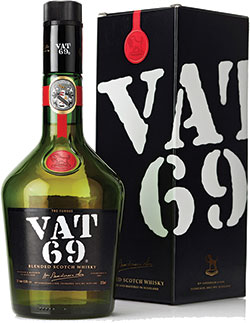
It was with such discerning impressions in mind that Diageo PLC undertook a rebranding of its VAT 69 blended Scotch whisky with a new label and bottle. Initially launched in Q3 2010 in India, the rebranding effort blends heritage cues from more than a century old identity with a contemporary treatment of an iconic bottle and label that are instantly identifiable for anyone aware of VAT 69 up to the early 1980s.
It was in the 1980s that the VAT 69 bottle shape departed from its longstanding identity to go with a light-green, straight-sided and high-shouldered sherry-shaped bottle and reworked label. The only visual cue linking back to the original brand identity was the stencil-treatment font for the VAT 69 name and its slightly canted placement. The old label was glue-applied.

“The new VAT 69 label and bottle offer, and reinforce, the visual impression of the brand promise, which is delivered by the product itself. Of course, no single element is a sole operative. All work in concert. This new VAT 69 label and bottle are a great example of the entire package being greater than the sum of its parts.”
The new bottle is dark green and features a low, prominent shoulder with a slight taper to the foot. A narrow, straight neck makes pouring easy, controlled and elegant, but also adds visual strength to the shoulder and body taper, yielding an overall masculine look and feel that is sophisticated. The bottle is available in 60ml, 375ml, 750ml and 1,000ml sizes.
The prime label needed to convey the traditions of the past, while providing some modern updates for re-establishing the VAT 69 brand. The best palette for this treatment was Fasson Bright Silver Foil facestock from Avery Dennison Label and Packaging Materials. The material is a white, wood-free printing paper laminated to a top-coated aluminum film.
Diageo and its London-based design agency, Smith & Co., needed a pressure-sensitive paper that could convey the traditions of the past, but also provide modern updates like embossing for an enhanced tactile feel and visual depth. They also required a company that could globally source the material.
“A key challenge for Diageo India was to create a packaging solution for VAT 69, such that it can be replicated across the world,” Dikshit said. “Avery Dennison worked closely with the Diageo India staff and the design firm, which helped make sure everything went according to plan.
“VAT 69 is a well-known respected brand, but that’s not enough. We have to be the market leader in India. To stand out and increase share, we needed to reinvigorate the brand’s history and heritage, and chose packaging to be at the heart of this effort. Getting back the iconic bottle was the first thought that came to mind, and everyone agreed.”
This new VAT 69 label and bottle are a great example of the entire package being greater than the sum of its parts
Heritage is a vital branding cue for VAT 69. William Sanderson first produced the whisky in 1882. He prepared 100 casks of blended whisky and hired a panel of experts to taste them. The batch from the vat numbered 69 was deemed the best tasting, and that’s the origin of the VAT 69 name.
Perhaps in keeping with that connection, the VAT 69 name has historically been represented in a stencil-based type treatment with a canted placement. True to the original, the rectangular black label—with its big, white, stencilled type—now yells VAT 69.
“The unbalanced angle of the name still reminds one of text painted on a wooden whisky cask—its true heritage—and more of a thing unleashed, the ink speeding with the force of its impact,” Dikshit said. “The key challenge here was to retain the rough edges and the rustic finish, as seen in the early 1900s.”
Also in those days, the VAT 69 bottle was sealed with a red ribbon and a lacquer seal bearing Sanderson’s family insignia—the Talbott Hound.
Today’s bottle has a black cap seal holding a gold-colored facsimile of William Sanderson, and the famous tagline “Quality Tells.” Sitting just below the cap is a modern adaptation of the original ribbon and seal, amenable to modern manufacturing.
“Our goal for the VAT 69 re-launch was to create shelf impact and suitable positioning for a mature, global spirits brand,” Dikshit said.
“The VAT 69 label and bottle together present the essence and equity of the brand. By retaining the heritage cues, the new bottle honors the brand’s historical past, while the featured trademark rectangular black label—with its white, stenciled type and gold embellishments—shouts craftsmanship.
“Going back to the original bottle shape delivers far greater value to the consumer, who seeks craftsmanship and expertise in his whisky.
“The VAT 69 packaging sustains the brand’s relevance and unlocks future growth. It enhances the consumer experience and wins at the moment of choice.”


