

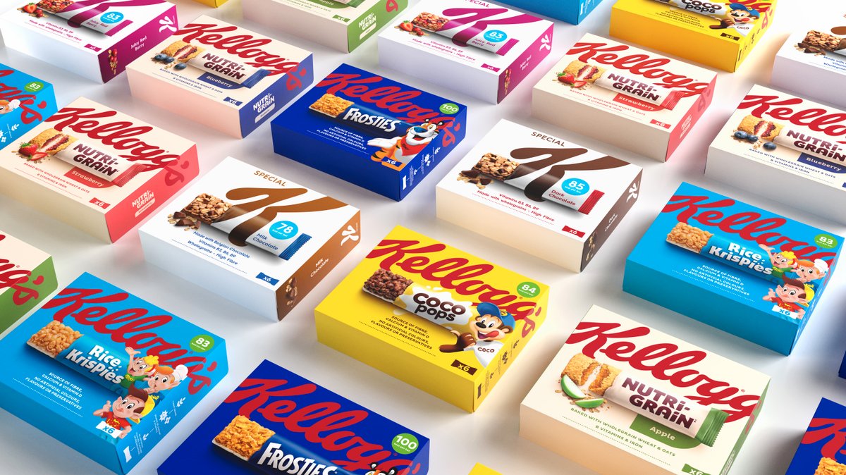
KELLOGG’S has debuted a new look for its snack range in partnership with brand transformation company, Landor & Fitch.
The refreshed snacks packaging follows on from the rebrand of Kellogg’s cereals in 2019 with Landor & Fitch, which saw the work collect awards from the likes of Grand Prix Stratégies du Design, Pentawards and Brand Impact, and then again in 2021 with D&AD and Cannes for the activation across outdoor campaigns in Europe.
Analysis of Kellogg’s share of the breakfast category identified an opportunity for the new snacking range. A lack of brand block on shelf, non-uniformity in its packaging sizes and a powerbrand-led design system meant the packaging was not standing out as powerfully as it could.
As a result, a new Kellogg’s snacking identity was created; one which ‘leveraged the strength of its iconic masterbrand’ – similar to the strategy behind its cereals rebrand – to produce a more ‘consistent’ look for the snacks portfolio and in turn, increase presence in the snacking aisles.
To deliver on the brand block ambition, Landor & Fitch developed a ‘coherent’ relationship between the Kellogg’s masterbrand and powerbrands through a balanced naming and branding hierarchy. A ‘bold’ crop of the masterbrand logo sits at the top of the new design, with the powerbrands’ assets elevated and centred underneath to ensure strong product representation and recognition.
Each bar is authentically pictured as ‘ripped open’ to reveal shots of the snack bars within, which Kellogg’s said demonstrates food appeal, enhancing their on-the-go quality but also making best use of limited space on the pack.
While the colour of each product box is set to the powerbrand or variant colour, the ‘recognisable’ red logo is constant – offering a ‘simple, clean and consistent’ look while ensuring ‘easy navigation’ both across the portfolio, and on shelf.
Kellogg’s added that the masterbrand logo helps to highlight Kellogg’s mission for good mornings across its snacks packaging range, increasing its visibility and reputation as the go-to option for consumers’ snacking occasions.
The roll-out has started across markets including UK & Ireland, Benelux, France, Italy, Portugal, Spain and MED.
Tristan Macherel, global executive creative director at Landor & Fitch, said, “Working within Kellogg’s design process, we developed a new and balanced design system for a very complex brand hierarchy across its snacks portfolio. The refresh positions Kellogg as the bold leader in snacking, reclaiming and reinforcing its iconic status while also celebrating each product.
“Our continued collaboration on packaging design with Kellogg is testament to the unique passion and push for the extraordinary from both of our teams, right across Europe. We look forward to seeing the snacks on shelves soon.”
Niamh Cribbin, Kellogg Europe marketing manager, added, “We saw the success of our cereal rebrand in 2019 and wanted to bring the learning and results from that into our snack range. We wanted to move from the established designs to make the range more edgy but without losing brand recognition which helps our consumers to spot them on shelf.
“We know people love, connect and engage with our brands and we wanted to make it easier for them to do that, which is why we’ve updated the entire portfolio at once. The exciting, modern design has been tested with consumers with overwhelmingly positive results and I can’t wait to see them take over shelves across Europe.”


