

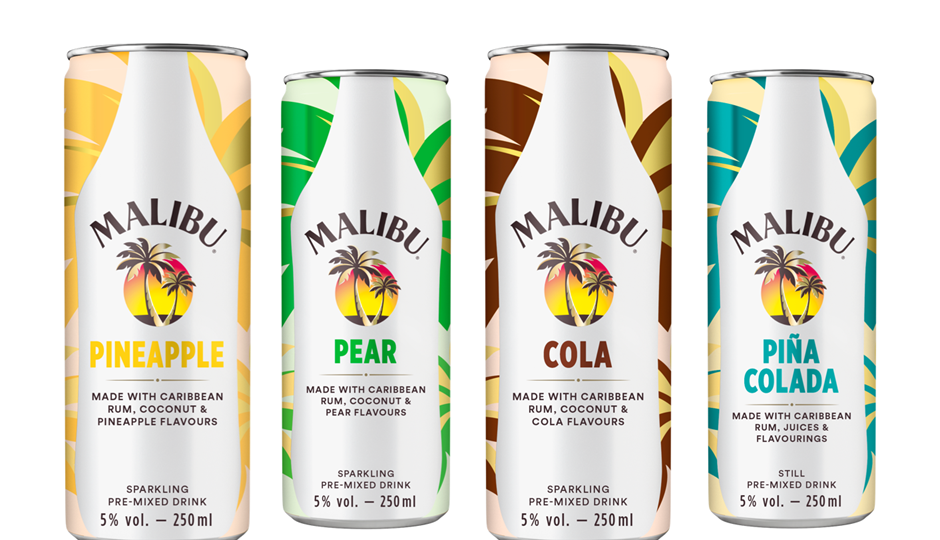
MALIBU has updated its design and logo in an attempt to maintain popularity with the younger generation.
The rum brand’s logo has been re-designed, and both the cans and bottle designs changed in a bid to ‘maintain strong brand equity and relevance with millennials’.
The new logo has seen a revised horizon, lifted palm leaves and sunset colours added. Whilst the cans have been changed to feature matte and glossy texture effects and now also feature an introduction of recommended serve images – with the intention of maximising the taste for consumers.
The new bottle has been designed by Stockholm-based design agency Brand Union. Dag Forsberg, lead designer on the project said, “Together we considered every single aspect of the design, optimising the Malibu brand core assets and approaching the overall design with a mindset relevant to the target group. Ultimately resulting in a fresh, contemporary, bold and confident design that allows a spontaneous and joyful personality to shine through.”
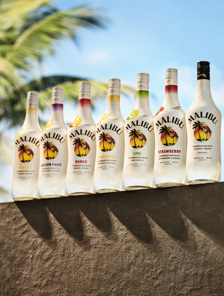
Elsa Rafen, senior global brand manager and lead of the re-design project added, “The purpose of the new re-design is to strengthen Malibu’s position as the number one flavoured spirit brand even further and to make sure that we stay relevant and top of mind amongst a future generation of consumers – including a more contemporary look and feel, better visibility in e-commerce and future proofing of our bottle design for growing use of image recognition technology in digital.”


