

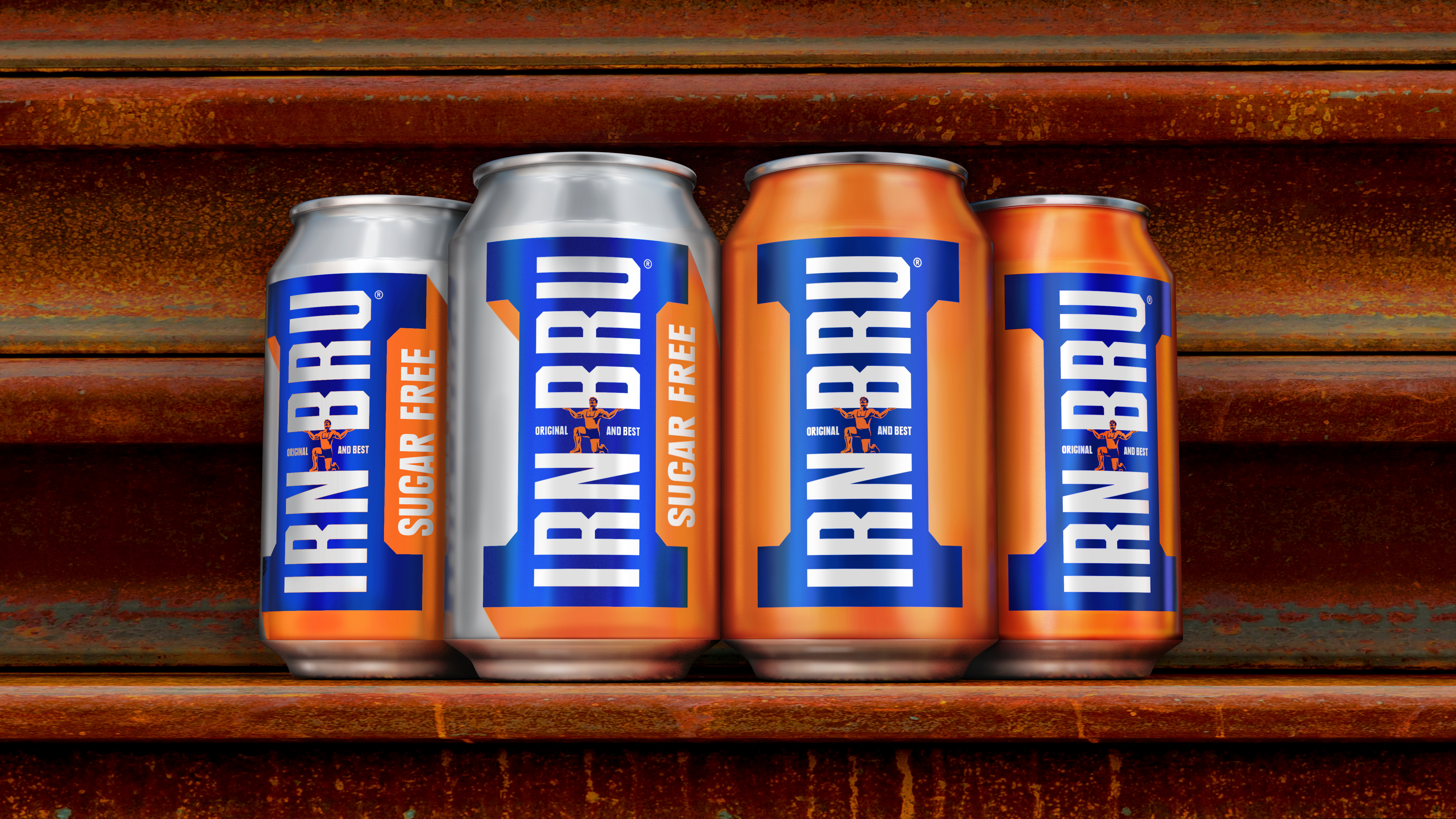
A.G. Barr has unveiled a new brand identity for IRN-BRU, created by brand design consultancy jones knowles ritchie (jkr).
The new look, the brand’s first significant redesign since 2008, aimed “to refresh and modernise the design, to deliver a clearly defined brand presentation which expressed IRN-BRU’s heritage and its association with strength,” according to a spokesperson.
The new branding draws inspiration from IRN-BRU’s ‘Made From Girders’ advertising campaign, with jkr creating a new icon utilising the end of a girder and creating a letter ‘I’.
Stephen McDavid, design director at jkr, said, “One of our main objectives was to bring the brand’s two variants – original and sugar free – closer together, creating a strong masterbrand identity. We also put a lot of emphasis on modernising the brand, whilst respecting its rich visual heritage.
“We worked closely with illustrator Chris Mitchell to resurrect the strong man from the original label, placing him back proudly at the centre of the brand. The wordmark has also been redrawn to ensure all the equities are communicating IRN-BRU’s bold strength.”
A.G. Barr’s head of marketing, Adrian Troy, explained, “Shapes, colours and iconography are essential components of the IRN-BRU brand and we realise how vital design and visual identity are in making our brand connect with consumers.
“It was crucial that our new look retained the cues that make our brand so memorable and brought forth our unique strength and heritage. It also needed to work for our existing base of loyal and passionate consumers whilst appealing to a new wave of consumers.”


