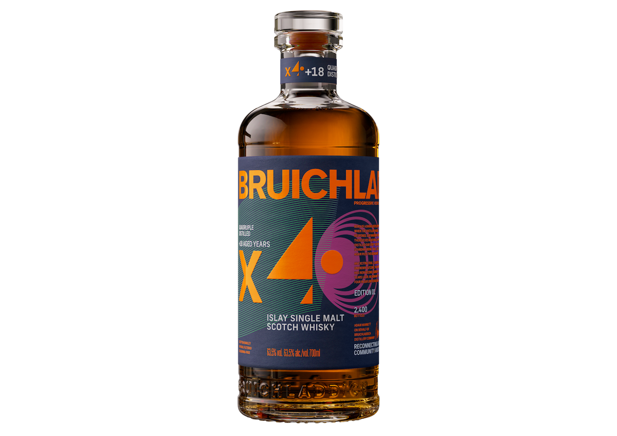
BRUICHLADDICH Distillery has unveiled the brand identity and design for Bruichladdich X4+18 Edition 01, the world’s first quadruple distilled 18-year-old single malt Scotch whisky, brought to life in partnership with the team at Thirst.
The first expression in a four-part series, the brand said that the packaging breaks new ground in Scotch whisky design – telling the story of X4+18’s radical distillation process through bold abstraction, geometric layering, and a vivid colour palette designed to challenge the category’s visual conventions.
The whisky is the latest example of Bruichladdich’s ‘boundary pushing’ approach to innovation and distilling. Reflected in its design, the creative direction of the four-part series aims to reinforce the brand’s commitment to being one of the most progressive distilleries in Scotch.
Gareth Brown, global marketing director at Bruichladdich, said, “Design has always been central to how Bruichladdich expresses itself. When the distillery team first experimented with quadruple distillation in 2006, it was a risk that went against convention. X4+18 continues that tradition, and the packaging had to be just as bold. Walk into any whisky shop, and you’ll see it instantly – it’s disruptive, it’s different, it’s Bruichladdich.”
For Matt Burns, co-founder and executive creative director at Thirst, the project was about giving visual form to the radical thinking behind X4+18. Quadruple distillation is said to be virtually unheard of in Scotch, and Burns’ wanted packaging that reflected that spirit of risk-taking.
Gareth continued, “Bruichladdich is a gift to design for. They give you licence to walk new paths and never repeat what already exists. Risk is behind X4+18’s creation, and it’s not just the way it’s created that’s different – it tastes different, looks different, and is different. Our job was to dial that disruptive energy up without losing the structural, uncompromising, character at the heart of the brand. Of course risk was involved, but it was absolutely worth taking.”
X4+18 Edition 01 comes in Bruichladdich’s proprietary Luxury Re/Defined bottle, made from approximately 60% recycled glass. The label wraps around the structure with a layered, geometric language inspired by Bauhaus design principles – part of Bruichladdich’s commitment to proving high-end luxury whisky can be desirable in minimalist packaging.
Four abstract graphic elements represent each pass through the stills, while bold, unexpected colour choices – including flashes of aqua and off-beat tones – mark a departure from what Burns describes as a ‘sea of beige’ often found on whisky shelves.
Gareth added, “Bruichladdich’s DNA is strong, robust, and authentic. The experimentation in X4+18 is so radical, and this design was about pushing that DNA further to reflect that. The brand has always been disruptive – from the original aqua bottle to the industry-first, fully recyclable, moulded James Cropper wrap on the Luxury Re/Defined range – and our role was to create the next industry reference point.”


