

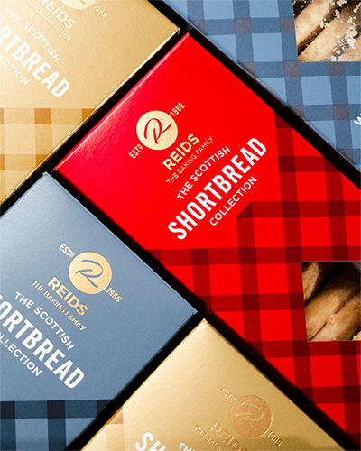
LEEDS-based FACER. Progressive Printed Packaging has revealed how a ‘minimalist’ approach to brand storytelling was taken in the creation of packaging for Reids of Caithness’ The Scottish Shortbread Collection.
Each packaging colour is designed to denote the flavours of the rich, buttery shortbread. This was achieved with sustainable vegetable oil based Pantone spot colours and metallics.
The packs were finished with Foilco Ltd satin foil, ‘subtly’ telling the consumer of the ‘high quality, luxurious’ nature of the goods from the artisan family run bakery.
A nod to Reid’s proud Scottish heritage is accomplished with a tartan design, including a diamond aperture that reveals the shortbread inside.
“Add this altogether and you have a perfect example of how your packaging can reveal layers of your brand story, every step closer the consumer gets to it,” FACER. Progressive Printed Packaging stated. “Let your consumer eat with their eyes before they get to eat what’s inside.”


