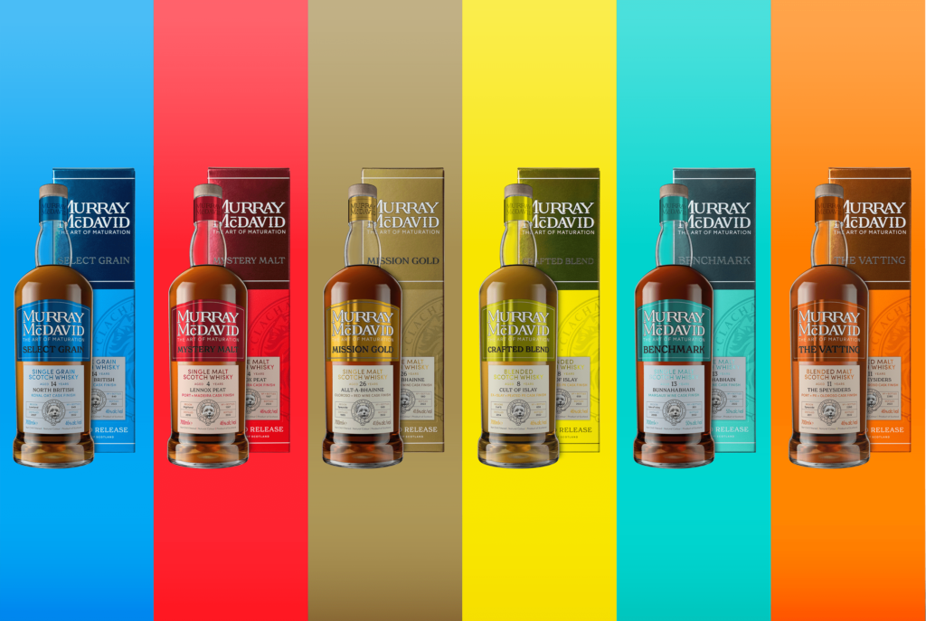
FALCONER has produced ‘distinctive’ secondary packaging for Scotch whisky brand Murray McDavid.
The ‘eye-catching’ design of the packaging retains the six core colours of the brand, which have been refreshed whilst staying true to the original distinctive Murray McDavid look.
With sustainability being a major consideration for the move, the new-look recyclable cartons replace previous tin tubes marking the start of a new chapter in the company’s 30-year history as independent bottlers.
Falconer worked with the Murray McDavid’s creations team to develop the new packaging. By addressing the brand’s carbon footprint and advances in packaging technologies, the aim of the refresh was to accentuate the brand’s craft features of authenticity and quality, whilst improving shelf presence and relevance across target markets.
Dean Jode, Murray McDavid’s head of whisky creation, said, “As our energetic, vibrant Scotch whisky brand continues to grow in new markets around the world and it was so important for us to take action to reduce our carbon footprint. It was vital for us to work closely with the Falconer team, whose expertise helped us make the best steps to realise our vision to create new, environmentally conscious packaging, whilst strengthening the bold, unique presentation of our Murray McDavid brand.”
For the cartons, Falconer used Nordica Duo 710, with matt varnish on the non-foil areas and gloss varnish on the foil areas to accentuate the spot colour. The carton itself was produced using a silver, over printable hot foil. One solid spot pantone was added over the baseboard and foil, which meant no register issues and a very clean finish.
A darker pantone was added to create the detail in the logo and drop shadows. Furthermore, the over-printable hot foil enabled the brand owner to use a generic silver foil for all variants and change the colour of the foil with a colour wash.
Falconer’s Colin Pow said, “The packs are unique in that they have clear colour differentiation which covers the whole carton. The key was to avoid any fit or register lines that were eradicated by one solid colour over foil and board. The foil colour is bespoke to the colour chosen by the brand owner. Any colour reference can therefore be met, which gives more flexibility when adding SKUs as they are not limited to a fixed hot foil reference.”


