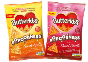
KP Snacks has updated the packaging across its Butterkist brand in a bid to introduce a new ‘modernised’ look to the range.
The packs feature the new tagline ‘Creating Smiles Since 1914’ which KP Snacks said highlights the popcorn brand’s heritage of ‘creating happy snacking moments for consumers’.
Further to this is the removal of previous solid coloured backgrounds in favour of more visual patterns alongside ‘playful’ fonts. The Butterkist heart has also been given a ‘cleaner’ finish in a bid to enhance product appeal.
The brand is also branching out its popcorn offering, by introducing popcorn crisps. KP Snacks said the triangle-shaped crisp has been created to drive interest and excitement through the novelty factor of a ‘unique’ crossover.
Kevin McNair, marketing director at KP Snacks, said, “With sharing occasions increasing as a result of spending more time home, we have remained focused on improving the in-home experience and in keeping Butterkist top of mind when choosing a snack for those nights in. Butterkist is a much-loved family favourite, so it is exciting to be introducing a fun and unexpected new product to the range, as well as a new pack design which reflects our heritage and personality.”


