

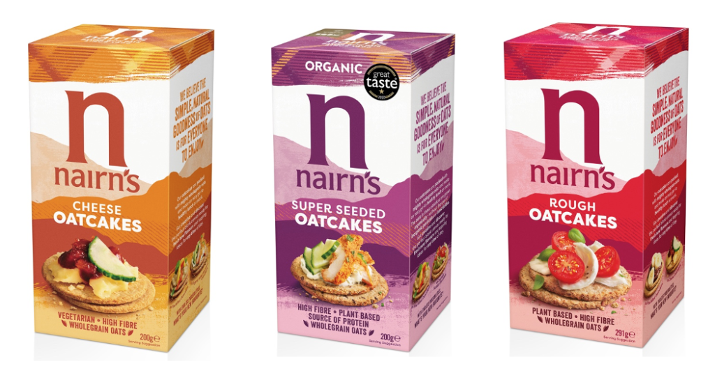
NAIRN’S has unveiled new packaging across its full range of products as it looks to position itself in the health and wellbeing sector.
The company, founded in 1896 in Strathaven, is the UK’s largest producer of oats. It said that one of the main goals of the new packaging is to attract new, younger consumers – with ‘extensive’ research being taken to ensure that existing consumers aren’t alienated.
Design agency This Way Up was appointed to lead the change. The company, which specialises in designs for health and wellbeing brands, was told Nairn’s wanted to ensure that all aspects of the rebrand retained the signature tartan, but with much richer, more vibrant colour palette.
The oatcake makers said that it is hoped the rebrand positions the firm in more of a lifestyle-led sector, amongst brands that are for those looking to embrace wellbeing and balance in simple and achievable ways.
Emma Heath, head of marketing at Nairn’s, said,“One of Nairn’s founding principles was for our products to be simple, natural, wholesome and delicious – a philosophy that still resonates with modern-day consumers and is embraced by Nairn’s loyalists in the UK and further afield. We worked extensively with consumer strategists at Map The Territory to better understand the changing health landscape and consumer needs, and this research has provided a solid foundation for the design work which is a significant step forward but still instantly recognisable as Nairn’s.
“The rebrand is designed to take our ever-expanding range of products to an even wider audience by making the brand more visible, modern, and appealing on shelf and highlighting its relevance to today’s healthy eaters as an integral part of their lifestyle, with taste and versatility at its heart.”
Vicki Willatts, design director at This Way Up, added, “Inspired by the rugged Munros of Scotland, the new design captures the textured and layered landscape, communicating all the natural, simple goodness of oats and celebrating the brand’s real roots. The colour palette references the rich, vibrancy of the natural landscape, whilst the informal style of real food imagery will inspire consumers to discover and enjoy the simple pleasures of uncomplicated wholesome eating.”


