

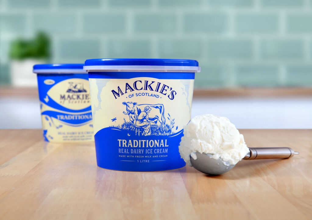
MACKIE’S of Scotland has undergone what it says is its most comprehensive rebrand in 30 years as it unveils its new packaging.
The pack design showcases a more simple, modern design, with a curved logo set over a bigger dairymaid – which the brand said is in celebration of its farm fresh real dairy credentials.
The new packaging is being supported by a ‘comprehensive’ marketing and advertising programme, which includes on-pack promotions coming later this summer and a new website.
Steve Curzon, managing director with Curzon Marketing, a food brand agency that works with Mackie’s, said, “The rebrand touches all aspects of the business – and is a response to the need to showcase to consumers, particularly those outside Scotland, the fundamental aspect which sets it apart from competitors – the Mackie’s real dairy difference.
“It is an exciting time of growth for the company and every step has been carefully considered with aspects evolving naturally, the use of the dairymaid retains connection to the company’s traditional farm roots, yet the new logo and design has a fresh, modern dairy feel.
“Each development was backed up with research – on what is most important to consumers and how we can help shoppers outside of Scotland understand the product and it’s USP.”
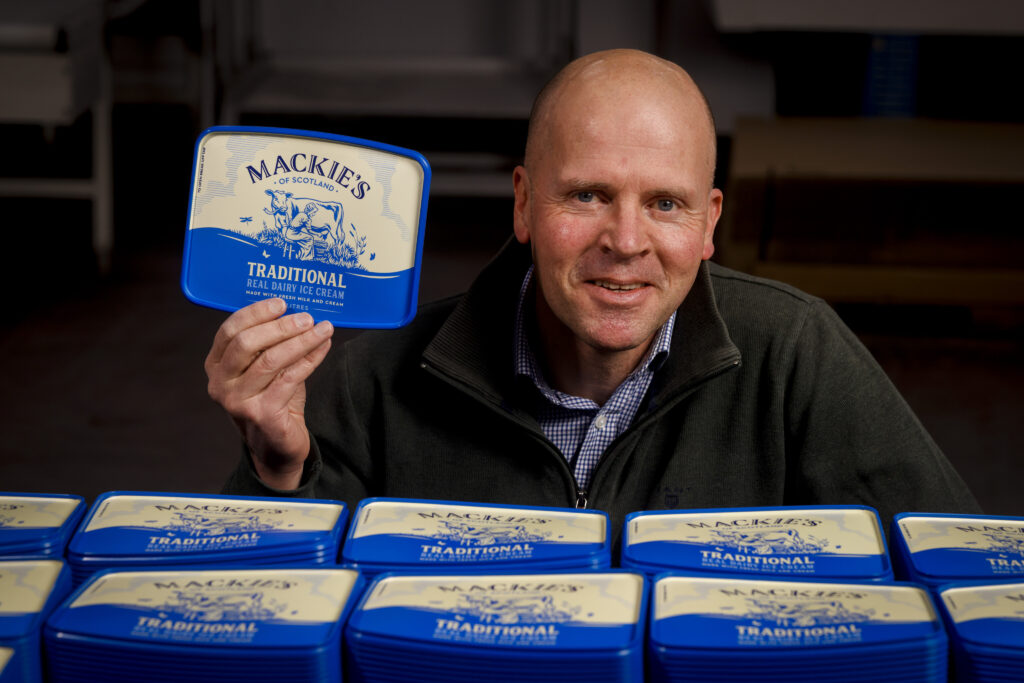
(Image: Ross Johnston/Newsline Media)
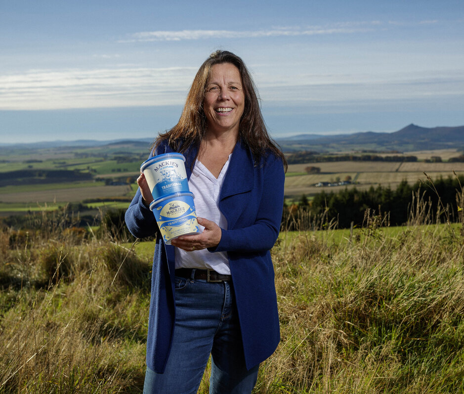
Karin Hayhow, marketing director and one of three sibling owners of Mackie’s, added, “My late father, who founded the ice cream business had a favourite saying: “No Change, No Chance!” With that in mind we are really looking forward to hearing what consumers think of the new packaging and hope that it will enhance shelf impact in stores, particularly south of the border.”


