
A series of talks at the Luxury Packaging Show on 1 October provided insight into some of the latest ideas for the packaging of premium quality spirits.
Kicking off the session, Daniel Szor presented on his experiences as founder of the small, independent producer The Cotswold’s Distillery.
Only a year or so into his experience of launching a premium spirits brand, Szor took the audience through some of the reasoning that had led to the company’s “pheasant” logo and the labels for its whiskey and gin ranges. There was an element of not wanting to be taken too seriously, he said, hence thngs like the “established 2014” age statement on the label, a nod to the likes of Highland Park’s similarly visible 1798 start date. With its mix of classic and modern fonts the design was intended to give the brand some mileage for the future.
They had also wanted to move away from the traditional rectangular and square label shapes, he said, in search of a package and label to which the eye would be drawn. The project benefitted from the guiding hand of Craig McKinley of Breeze Creative, a well-known graphic designer in the spirits industry.
From this exploration of how to launch a new spirits brand, the talks moved onto looking at how traditional brands can be revived or revamped.
Stephen Marshall, global marketing director for single malts with Bacardi was accompanied by Ivan Bell, group managing director of Stranger and Stranger, in a run-through of the packaging and brand development that went with the recent launch of a range of single malt Scotch whiskies from John Dewar & Sons.
What seemed especially interesting about their methods was the time spent immersing themselves in the environment and folklore of a particular distillery, even to the extent of collecting oral histories, which were used to tell the brand story.
“Telling stories” about a brand is a vital element, suggested Bell, and with the right mix of typography, illustration and high production values, it is possible to create a very strong brand identity in this way.
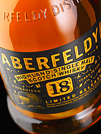
Aberfeldy was one of the malts lined up for a makeover. It is a “magical, mystical place” said Marshall of the distillery’s home town, with some of its own strange hallmarks, like the traces of alluvial gold present in the local Pitillie Burn, which supplies the distillery. The whiskey itself has a “fruity, mellow, rich, honeyed character”.
Translating these elements into a kind of “golden dram” brand story led to the use of a bespoke gold paper across all the packaging, in addition to other elements such as textured cloth on the boxes, and the use of subtle black-on-black print. “We didn’t want it to be too bling, as that would position it differently,” he said.
Answering an audience question about ROI for the Aberfeldy revamp, Marshall said that since launch they’ve gone through 12 months stock in three months, and are expecting to go from selling 22,000 cases per year to around 120,000 per year in four year’s time. It has also picked up “Highland Whiskey of the Year 2014” from Whiskey magazine.
With what you might expect to be a more limited appeal, Craigellachie has a meaty, sulphurous character. Reflecting on its Marmite-like, love-it-or-hate-it qualities, Bell outlined their attempts to tell a brand story of “traditional steadfastness”. Certain obvious nods to the past are present with the branding and labelling, such as the large decorative ‘C’ used for the name itself.
Inside the distillery they found an old etching on a wall showing how the building used to appear, and this was also incorporated in the packaging. “Slightly eccentric” typography emphasised the sense of “we’re doing it our way”, an element of the brand identity.
Seafaring elements were to the fore with the branding and packaging of another range of Bacardi single malts, The Deveron, due for release in Summer 2015. Its positioning is summarised as “a shelter from the storm”. Old fishing trawlers and the coastal locale (where the River Deveron meets the open seas) were key to a brand story that led to the use of frosted sea glass. Marshall said: “One thing we learned: When the design agency comes up with idea of using sea glass, say no.” Bell joked that it wasn’t their job to make it easy.
Fishing fly boxes inspired the design of one of the gift boxes. Within the box the bottle is held in position by protruding ribs, mimicking the ribbed construction of wooden-hulled boats.
While the presentation put great store in the use of oral histories for developing a brand story, Marshall shared a jokey note of caution. During the project one story began to be developed about the pears that had been said to float around the containers in one distillery, assumed to have fallen from nearby trees. In later attempts to confirm the story’s authenticity he was forced to conclude he had simply dreamt it up, a blunder he says cost them several months work and very nearly lost him his job.
The drive to create a unique experience for the consumer was no less in evidence with the next speaker, Sharon Crayton of Ardagh Group, who appeared with a presentation about how her company had approached the challenge of Absolut Vodka’s recent campaigns.
PERSONALISING BOTTLES
Crayton revisited recent developments with individual personalisation – “a great way to add emotion to packaging and engage the consumer”. She recalled Coke’s recent campaign, and its use of bottle labels carrying one of 250 of the most popular first names in the country. This still meant a lot of people were left unable to find a bottle bearing their own name. To address this Coke set up special “Share A Coke” kiosks at theme parks and other events. People could queue up to get a bottle with their own name on it. At the time it was reported that the kiosk in Thorpe Park (a theme park near London) had queues longer than those for the rides themselves, a hint at the thirst that exists for this kind of personalisation.
It was this wave that Abolut intended to ride with its 2012 Absolut Unique campaign, which set out to produce 200,000 bottles each configured with a unqiue combination of coating, printing and labelling.
Speaking of the production challenges, Crayton said introducing “randomisation and variation into a process that’s been refined over many years to produce consistency” involved “tearing up the rule book”.
It was “one of the most challenging and demanding campaigns Absolut have presented to us” since it left no room for compromise on either aesthetics or productivity.
The first process, that of coating, involved the use of 16 different process colours. She says: “In the early stages we realised that a number of colour combinations didn’t work – they were either inspid or clashed”. This aspect of bottle decoration involved the coordination of six different spray guns applied to four different sections of bottle. Complex algorithms were used to combine randomisation with the elimination of undesirable colours.
Printing was the next stage, again involving 16 colours but this time in combination with 51 different non-directional patterns, each requiring its own printing screen. “Our operators became very good at changing screens,” she said.
And the final stage in this process was that of applying the label. All together, the different random combinations of these three elements of coating, printing and labelling produced 94 “quintillion” permutations or possible bottle designs, said Crayton. “So we were confident that no identical bottles were created”.
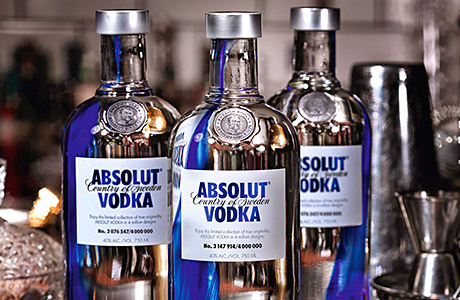
But uniqueness of surface decoration was clearly not enough for Absolut, as its next campaign called upon Ardagh to imbue this uniqueness more deeply within the bottle itself, taking them into previously unexplored aspects of glass making.
The Absolut Originality campaign distributes bottles each with its own unique splash of blue colour within the glass (see image, left). Crayton said this blue splash had to be introduced at the point where the molten glass is residing within a large furnace, just before it goes out to be formed into bottles. “A bit of magic kit” was employed, she said, to introduce blue cobalt into the mixture via a tiny gap at the top of the furnace.
It sufficiently impressed the judges at the show’s awards that Ardagh picked up the prize for Innovation of the Year for Absolut Originality. They said that “by using partial colouring for the first time on a commercial scale with a drop of cobalt blue infused into the molten glass, and completing this in 3 weeks something truly remarkable has been achieved”.
Crayton said that Pernot-Ricard has the intellectual property rights to the blue stripe, so – for those looking to try something similar – “other colour strokes are okay but blue might be a problem”.


